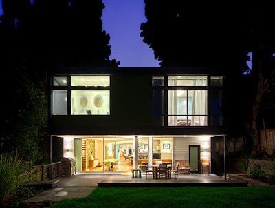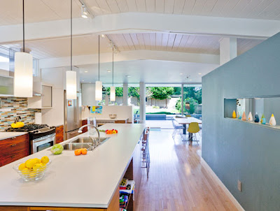


Love the gray and citrus in the living room, that is currently one of my favorite color schemes.
This mid-century house was designed by Jill Lewis and Lane Williams of Coop 15 Architecture. Later renovated by Robin Chell Design studio. Click here to view more pictures.
Tuesday, October 19, 2010
House Design
Subscribe to:
Post Comments (Atom)


3 comments:
I love the clerestory windows! Brings in so much natural light, which bounces all over the beautiful white walls.
drool.
I love the wood floors they chose. The light tone is wonderful. Honestly, I love the design of the living room, but think it could almost be borderline "too mid century." Do you know what I mean? Like there should be a mix of some other stuff to make it look less like a museum of that era and more like a real, well designed home. I love every piece in the space, but might not choose to have all of them together.
Just some thoughts :)
Bethany
www.DirksenDabbles.com
There are so many things that draw me to this home, particularly the color scheme (my favorite) and the mix of materials. I do tend to agree with Bethany that it needs a little mix up in the living room. Other than that, it's just gorgeous. I'm off to check out the rest of the photos now.
Post a Comment